

Backstage with Matthew: Taking to the high seas

The set of Billy Budd in all its Naval splendor.
It’s worth noting first that nautical and theatrical worlds are not so far apart. There’s an important word that connects us both: “rigging”. Sailors with highly developed skills in rigging ships found excellent onshore work possibilities in theatres where the flying system of ropes and pullies came very naturally. That interconnectedness became the very basis of this production of Billy Budd, originally designed for Glyndebourne in 2010 (the opera company I profiled in my last Backstage with Matthew).
When Glyndebourne commissioned the production, they did not propose a specific aesthetic; rather what you see is their interpretation and perspective on the piece. Christopher refers to himself as a classical and textual designer – someone who seeks to deepen our connection to the work as created by composer and librettist, not someone who cuts against those intents. He knew that he wanted to find an aesthetic world that supported Benjamin Britten’s story, and one that allowed us into an 18th century Man O’ War and all of the detail that Melville conjured up in the novella.

His first source of inspiration was the Glyndebourne opera house itself. Designed very much as a circular horseshoe, and built out of a soft-toned wood, Christopher saw a great opportunity to use the ship on stage to complete that circle of the auditorium, naturally inviting the audience into the atmosphere of the HMS Indomitable. Even the balconies were designed to line up with the balconies at Glyndebourne. While we have a very different style of opera house here in San Francisco, our boxes actually do intersect with the middle deck on the ship, so we will have that same sense of being pulled into the action.

Another set of inspirations for the ship came from Christopher’s own childhood. As a young boy growing up in Sussex (the county that is home to Glyndebourne), he visited the HMS Victory, the ship used by Admiral Lord Nelson to defeat the French at the Battle of Trafalgar. He also has a visceral recollection of an exhibit at Madame Tussauds waxwork museum in London that used early multi-media effects of light, smoke and even smell to create the sense of Nelson’s ship. A more recent inspiration was the Vasa Museum in Stockholm, featuring the world’s best-preserved 17th century ship.

As Christopher notes, the world of an 18th century Man O’ War was a very hierarchical one. It’s reflected in the drama of Billy Budd – both the music and the libretto – and you get a very clear sense from the HMS Victory picture just how stark architectural hierarchy could be on a ship. That is borne out in Christopher’s designs: the striking use of levels allows us to be immersed in the hierarchy, with the placement of Captain Vere and his officers always reflecting the power balance at play, and the aspirations of Billy to climb higher and higher in that hierarchy e portrayed through vertical movement.

What really appealed to Christopher was the detail in the opera – not only the details of time and place that are so rife in Melville, but also the details of the individual journeys that each character takes. Yes, it’s a story about the colliding worlds of Budd, Vere and Claggart, but each of the characters has a very finely painted history and arc. In fact, on the first day of rehearsals, revival director Ian Rutherford encouraged each of the cast and chorus to find a seafarer in their own histories and channel that person. (I actually have an ancestor who was an early 18th century privateer, and who captained a boat around the world and wrote a book about it – Captain George Shelvocke!).
With so much visual possibility, Christopher had to decide on the level of detail and abstraction to incorporate into the set design. He and Michael Grandage ultimately ended up with a stylized ship that creates a faithful perception of an 18th century ship, but in a way that is in many ways a complete abstraction. A replica cut-away of a ship on stage would not have created the necessary spaces and focus for the drama. By taking the elements of a ship and creating an incredible three-dimensional forced perspective, Christopher pulls us into a world that feels very clear and historic, seducing us into the idea of a ship, rather than the reality of a ship. He allows us to be completely engaged in Michael Grandage’s dramaturgy, with just enough detail to ensure the ship can always be active and dramatic, but never cluttering the emotional focus of the protagonists.
The set’s whalebone-like architecture creates a world in which straight lines are almost completely absent and the curving side walls create a sense of claustrophobia. The raked floor is actually a curved rake – an ingenious deck the likes of which I’ve not seen before. The forced perspective becomes a trick of the eye; from the house the ship looks to be massive, but onstage it’s actually relatively shallow. Every element had to be carefully crafted to create the optical illusion of depth. There was no magical mathematical formula or computer program that could be used for this, not least because there is no one point in the house from which a perspective can originate. Every seat in the house has a different view, and so the job of a designer is to create the best possible experience from a wide variety of perspectives.
There are a number of very clever facets built into the set that allow us to move to different parts of the ship with ease. Captain Vere’s office is created by a simple unit that lowers down through the ceiling, creating an intimacy within the ship. A more claustrophobic presence is created by the lowering of the entire ceiling itself, which happens twice in the opera: once when we head below decks to the raucous world of the sailors; and then once when we see Billy alone, facing death.

The exterior of the ship is fully covered in a metal frame up which cast and crew members can climb, allowing us to feel a perpetual energy, height and activity on both sides of the ship.

And then there’s the movement of the ship itself. Yes, this massive structure actually moves onstage during the prologue and the epilogue, moving slowly on a hydraulic track. As Vere reflects on the impossible decision he was forced to make, the ship gradually moves down out of the darkness, emerging into consciousness as Vere recalls the events of 1797. You don’t even really see it happening. Rather you feel it. You feel the presence of the ship growing onstage, gradually immersing you into its might. It’s an extraordinary effect!

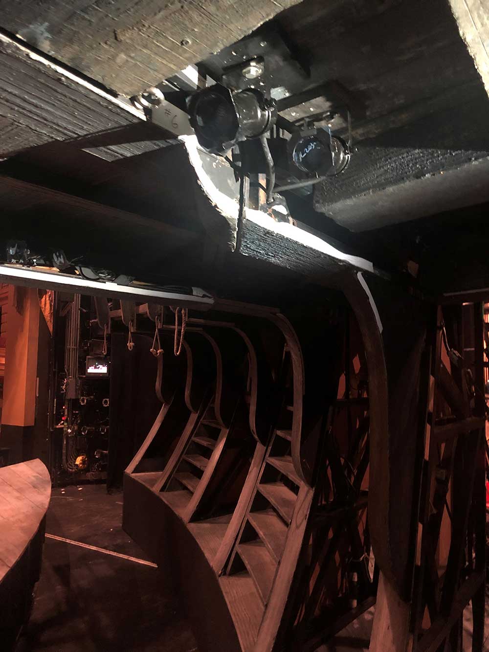
One of the challenges of the ship is how difficult it is to light. Because it fully encloses the stage with walls and a ceiling, the lighting designer (originally Paule Constable, revived here by David Manion) has to find access points wherever they can, particularly if they want to avoid everything being front-lit which would wipe out the nuance of the experience. Lighting instruments are hidden all over the ship, allowing for evocative lighting from within.
Christopher has a passion for history and notes that one of the joys of the job is being able to become an expert on something for a brief period while you are creating a production – in this case 18th century naval warfare. This is particularly apparent in the costuming, which creates a visual representation of the ship’s hierarchy through clothes. Aside from the formality of the officers, there’s probably a greater homogeneity of sailors’ costumes in the opera than you might have seen on a real ship – it’s important here to create a unity of color and style for the crew to allow the officers and key characters to pop. Christopher mentioned a particularly important book that became an inspiration for his costuming: “Dressed to Kill: British Naval Uniforms, Masculinity and Contemporary Fashions, 1748-1857”.

I don’t think I’ve experienced a set quite like this before – a set that fills the vertical as well as the horizontal with such purpose, and that creates an immersive experience from every seat in the house. You will be invited to take your own place on the HMS Indomitable and be transported back to 1797 in the most extraordinary of ways. This is the kind of theatrical experience that will stay with you for decades – an immersive world created through Britten’s incisive, searing opera, Michael Grandage’s compelling dramaturgy and the extraordinary design of Christopher Oram’s ship.
It’s time to set sail!